|
|

|
EXISTING LOGO CHALLENGES / SOLUTIONS Graphics Viewpoint
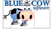
- The traditional, serif typeface is at odds with the simple/cartoon style of the graphic, and the subordinate use of lowercase italics for ‘software’ diminishes what Blue Cow does.
- The use of gradients and shading in the cow graphic complicates its natural simplicity.
- The integration of type and cow graphic lacks a clear focal point (as shown in the outlines below).
Cow Graphic as Focal Point / Solution to Focal Point Challenge
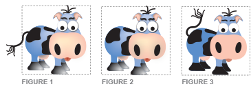
- Figure 1: On its own, the cow graphic fits into a square (focal) frame, but the tail breaks the focal point. By pushing out of the frame, it distracts the eye because of tension caused by the disruption of symmetrical harmony.
- Figure 2: However, removing the tail diminishes the cow.
- Figure 3: Our solution was to change the orientation of the tail. The logo is now fully contained within the focal area, creating visual harmony. An added bonus: the new orientation (facing up) has a friendlier feel. Shading and gradients have been removed, making the style treatment compatible with the flat style of the image.
Marketing Viewpoint
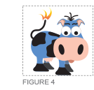
- The logo does not communicate what Blue Cow does; for example, it could be children’s software. A tie-in is needed to marry the logo to the type of business.
- Figure 4: By making a simple adjustment–removing the ‘hair’ of the tail and replacing it with a flame, we now have a connection to the business. In addition, the hair on top of the head has been finessed to make it more symmetrical and balanced.
Typography
- Before: as previously stated, the traditional serif typeface is at odds with the simple/cartoon quality of the cow graphic. The word ‘software’ is subordinated to the name, which diminishes an important piece of information about the business. The dark drop shadow ‘muddies’ the type, particularly in the more delicate areas of the italics letterforms.
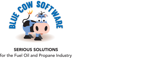
- After: the san serif typeface Muro Regular was chosen for its simplicity, bold quality and high letter height. All three words have the same weight.

Tagline
- Since the cartoon cow is at odds with the serious nature of the business, we created “Serious Solutions for the Fuel Oil and Propane Industry” to communicate a clear positioning statement.
End Result
- The type is integrated with the cow graphic. A softer, more subtle drop shadow has been added for dimension and to compliment the flat quality of the cow graphic.
- A subtle shadow of ‘land’ under the cow gives it an anchor (weight).
|